I was pretty excited when Dropcloth Version 1.5 was first announced, and undoubtedly, the EMGY colourway was the one that I hoped will emerge first. When it was later announced to be Peaceday that will pioneer the DC1.5s, I was kinda bummed. But on the day of the drop itself, EMGY appeared as one of those irritating surprise drops...
... and I was immediately reminded of the hours of F5-ing that I did for my EMGY Grunt.
I am not sure how many readers of this review are working fathers themselves, but between work and family, F5-ing has proven to be a rather difficult task. So I was ready to give it up when a great buddy of mine sent me a text message telling me he got me covered. I doubt he wants to be labelled as "Legion", so I'll just say a friend in need is a friend indeed, and that I owe him much for the fact that I own an EMGY DC1.5. Turns out, it wasn't that difficult to score one if you tried, and here's the evidence.
When these figures were delivered and in-hand photographs started to turn up on the forums, there was great controversy over the paint application and weathering on the EMGY shield. More on that later. Mine arrived in late May and I took my time to get them opened up and played around with the figures. One thing: EMGY came with more weapons but PD came with a folded poster.
This is probably going to be the most picture intensive review that I have ever done on a single toy, so... be prepared.


3A's way of designing their packaging seems to have evolved from a more retro shoe box style to a more elaborate one, often with A.Wood's art work on the front, and some CAD drawings of either the figure or its weaponry on the back. I'm kinda glad that A.Wood created two paintings for the two factions, unlike what was done for Kow Yokoyama's Krote. C'mon A-胖, don't be lazy and paint us Bambaland Exclusive Krote supporters an original box art!! Then again, while the art work on the front tallies with its content, the weapon schematics on the back are just cookie cut for both the Peaceday and EMGY. The latter sports more weapons (riot shield and baton), so rightfully, they should be reflected on the box, but they aren't. Okay I'm just old school and prefer to see more of A.Wood's art not obscured by any white cut-outs or texts or margins or hatchings, and nitpicking on the unimportant details. The inserts are standard transparent plastic trays so I'll dive straight to the figures.


I must say, when I first freed them from their plastic prison, I was rather impressed. Apart from a couple of loose elbow upper hinges and bicep swivels, the construct of this robot figure is great. ThreeA is really in a league of its own when it comes to creating toys that are super articulated and detailed, not to mention the relatively lower price that they come at. I have already been out priced recently with HT's diecast ironman and SS's new Vader, but still ok with 3A's recent offerings.


The fact that these figures are labelled as Version 1.5s seem to suggest that, to some extent, they resemble / pay homage to its predecessor, with modifications that are not too drastic (hence not Version 2). One of the changes most immediately noticeable are the eyes. The cyclops of the OG DC has been changed to a pair, akin to what we see on the OG Brambles. The disk head of the OG was mounted on a single balled post and used to be fairly well shielded by its cylinder body. For the 1.5, a longer neck stump has been given, and double-balled to give a wider range of movement. Along with the elongated neck, "collars" are introduced at the top of the cylinder body to offer more protection. We don't want 'em snipers to take out the heads of our DCs too easily, do we?


I didn't really like the base colour that was used for Peaceday's head. To me it looked a little translucent and the head looks very plastic-like, instead of metal which it should have portrayed. I know I'm offending many people by saying this, but no matter how ferocious you imagine the PDs to be, they are wimps and inferior to the EMGY faction in all ways aesthetic. EMGY FTW~~~!


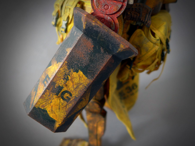

Another additional feature are the forearm armour plates that were completely absent in the OG. This seems like something borrowed from the Grunts. The forearm plates are articulated via a ball jointed post. Interesting to note is that the post and the ball is not a completely rigid joint. It seems there is a hole in the ball where the post slots into, allowing a little swivel movement at that insertion point (notice the yellow post inserted into the white ball in the pic above). My guess is that this joint is introduced to deter breakages, but that slight swivel movement is a little awkward.
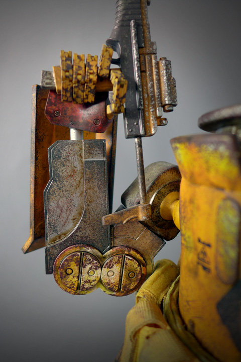


The other changes are more subtle and aimed at improving the articulation of Dropcloth. For instance, longer double balled shoulder joints are used. Instead of the old single hinge, a double hinge is used for the elbow. The range of movement is definitely an improvement, but not as significantly as I thought it would. The typical "T"-crotch joint has been replaced by a "Y"-crotch. I'm not too sure what the intent of this change is for, though it certainly gives the figure slightly more height. Being a downward slant, the ball post that forms the hip joints actually obstructs the leg movement earlier than it would a T-, ie. you can't achieve a wide stance due to this design. If the legs were clock hands with the head pointing at 12-o'clock, the most I could achieve is 5- and 7-o'clock. Further, posts have been reported on forums to be snapping due to the tightness of the ball joint so please be cautious.

The feet is also given two additional hinges, allowing it to curl upwards. I find these additional joints, which were previously absent in the OG, particularly useful at simulating walking / running movement. For my Peaceday though, the right ball at the feel is unpainted, and I'm pretty certain it is sloppy QC rather than an intended "sock" effect (pic below).


Weapons are something the DC 1.5s aren't short of, and even more so with the EMGY as it comes with the additional baton and riot shield. First, we have a machine gun and a shot gun. Then, we have the twin pistols. Finally, there is an additional cleaver for when you run out of ammo and want to go close quarter melee. There are also tonnes of pouches and buckles along the belt where you to get creative with keeping away these weapons. For example, I put the right waist pouch buckle through the trigger guard of the shot gun and leave it dangling there.


The shot gun has a handle at the front for a firmer grip, and it is sculpted to look like it has a workable hinge, and possibly even slide along the lower barrel. However, looks can be deceiving, and all these joints are fixed, which, to me, is quite a pity. I would really have preferred if the handle can be folded in parallel to the barrel, with the option to slide it nearer to the trigger.


Overall, the DC1.5s are nice creations on their own. If the OG Dropcloths are a lean, mean fighting machine, these 1.5s really are more...
From this point on, I want to continue the discussion by scrutinizing the differences between the OG and v1.5 DC, focusing on the EMGY Colourway. The OG EMGY DC really is the holy grail of my collection, and while I'm happy that it is being reinterpreted in an updated version, I really wasn't impressed at all when I placed them standing side by side.

It can be hard to tell from the pictures, but one very noticeable difference with the paint app is the new orange burn tint that is applied all over the new bot. Comparatively, the OG is much more yellow and never really so orange. This is most visible on the shield. Up close and in hand, I can see what Kim meant when he defended the company's work, as the weathering on the new shield, though distinctly different in style, sees many layering of rust, paint, decals and scratch marks.


I too agree that the mistake was to sell the product without any actual sample photographs. When you say EMGY, people have a very good preconceived idea about how the colourway is going to turn out. The v1.5 EMGY is done pretty close to its predecessor, despite the orange tint. We are talking about a company who claims this and this are the same colourway, so we are probably lucky that the EMGY v1.5 turned out the way it did. Phew! Lucky us!
A lot of times, sales are made with just a sketch from A.Wood, and it takes alot of faith to throw hundreds of dollars at just that. You can say that you signed up without knowing the outcome in the first place, so you are in no position to blame the company. On the other hand, any respectable company should feel lucky to be showered such blind faith and be totally responsible and accountable for the outcome of their product, which, ultimately, should satisfy the customer. The paint application on the EMGY shield really surprised everyone, and, like all surprises, some might not take it so well. However, instead of offering to change only the shield, 3A offered a total refund for the entire figure, which to me only made business sense that benefits the company and nothing more. What happened to the care for Legion (tsk tsk, I'm humoured by myself) that ought to have been rendered? In short, I felt that they should offer anyone who absolutely hates the shield but love to retain the figure a replacement shield.


The sculpting of the riot shield and the baton are exactly the same between the OG and v1.5, which is great. Throughout the body of the figure, you can see many similarities in the way certain red highlights are placed, particularly on the hands and left elbow. Both OG and v1.5s have a yellow right leg and an off-white left leg, and both have their pistols painted to a faded yellow colour. Since there are so many consistencies, I find the decision to take such a different artistic direction for the riot shield to be rather wilful.
My personal take on the shield? I appreciate the effort that went into its production. It is a refreshing take and something I can accept. I will not go so far as to say it stands out from any EMGY squads like a sore thumb, and I will not go through so much trouble as to get it replaced, even if replacements were offered. Remember, you can send it back for it to be reworked upon, but the outcome can potentially be much worse. Anyway, nothing that has ever been done since 2012 can ever match up with an OG.

I guess the natural question to ask is whether the v1.5 EMGY is able to hold a candle to the OG, though it is quite a pointless query.... I once read on the forums that a good benchmark was to ask yourself which you would rather buy, under the hypothetical scenario that both are equally priced and in abundance. I asked myself, and got my answer. To quote the guest that left Wayne Manor slightly before Ras Al Ghul and his thugs burnt it down in Batman Begins, "The apple has fallen very far from the tree, Mr Wayne." The form of the figure is rather subjective, and while there are slight improvements in articulation, the quality of the paint app and the construct of the joints are both significantly inferior to the OG.
An adequate substitute to the OG? Sorry, but no. We're not even close.
A few more shots of the duo...!


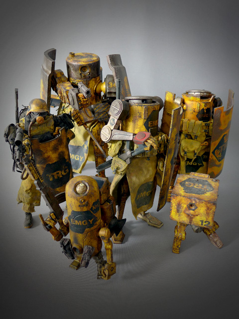
Finally, an updated pic of my EMGY squad. I think I need that 1/6 Armstrong, but, alas, I haven't been able to get one at a decent price. Something I can live without I guess.